반응형
infinite scroll을 사용한다던지 디자인에 맞춰 높이를 창사이즈에 맞춰 조절해야 할 때
CSS를 사용하여 조절이 가능합니다
예를 들어 이하의 구조가 있다고 하면
.content의 높이 = container의 높이 - header의 높이가 되게 하는 경우의 높이 설정방법입니다
<div class="container">
  <header class="header"></header>
  <main class="content">
    <section></section>
  </main>
</div>
방법 1
flex-grow
.container {
display: flex;
flex-direction: column;
height: 100%;
.header {
height: 96px; // 높이가 정해져있을 경우 설정
}
.content {
flex-grow: 1; // 단말브라우저에 맞춰 높이를 조절
overflow-y: scroll;
}
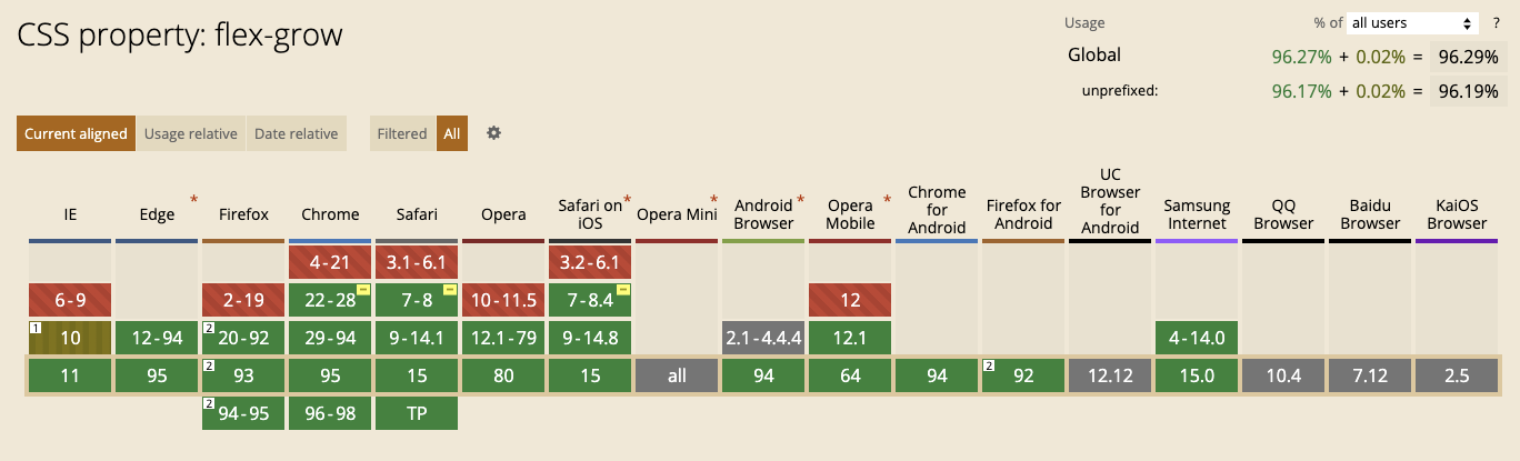
}( 브라우저 호환성 )
방법2
calc(100% - xxx)
.container {
position: relative;
height: 100%;
$headerHeight: 96px;
.header {
height: $headerHeight;
}
.content {
position: relative;
height: calc(100% - $headerHeight);
}
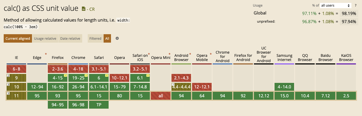
}( 브라우저 호환성 )
반응형
'IT 노트 > CSS&SCSS' 카테고리의 다른 글
| 디자인 시스템이 무너질 때, Tailwind로 유연하게 대응하는 법 (0) | 2025.04.08 |
|---|---|
| Tailwind가 불편했던 나에게 – 왜 인기 있고, 어떻게 잘 써야 할까? (0) | 2025.04.07 |